top of page

Redesign
Evaluation
and
Heuristic

About the Company
Upwork is a global freelancing platform that connects businesses with independent professionals. It enables remote collaboration across various fields like design, development, and marketing, offering tools for hiring, communication, and secure payments. Upwork supports flexible work arrangements through hourly, fixed-price, and contract-based projects.
Category
Usability Testing
UI Design
UX Design
Methodology
Heuristic Evaluation
UI Design
Tools


Before
.jpg)
.jpg)
After


Usability Heuristics
Usability heuristics are general principles or rules of thumb that guide the design of user interfaces to make them more user-friendly and effective. They are not specific guidelines but rather broad principles based on research and understanding of human behavior, used to evaluate and improve the usability of a product or system.

01
Visibility of System Status
The design should always keep users informed about what is going on, through appropriate feedback within a reasonable amount of time.

Issues
Filters or suggestions not visible on job search screen initially.
No real-time feedback for applied filters in job search.
No of connects left is not constantly visible.
Recommendations
Search Filter field should be placed together with the search bar
A loading or transition screen should be visible after applying filters
Adding a connects section at the top of the status bar may help review the connects constantly
Redesign


02
Match Between the System and the Real World
The design should speak the users' language. Use words, phrases, and concepts familiar to the user, rather than internal jargon. Follow real-world conventions, making information appear in a natural and logical order.
Issues
Terms like “Connects,” “Rising Talent,” “Job Success Score” may confuse new users.
Recommendations
Brief introduction of such terms can be added as a tooltip.

03
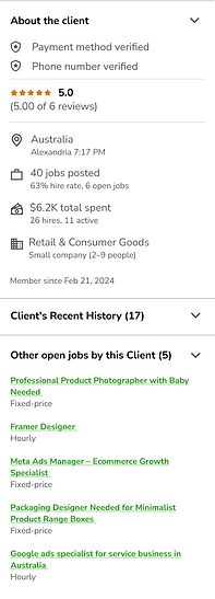
User Control and Freedom
Users often perform actions by mistake. They need a clearly marked "emergency exit" to leave the unwanted action without having to go through an extended process.


Issues
No confirmation page before applying to a job
A disliked job cannot be removed from the job search list.
Can’t collapse sections (like “About the client”) to focus on the job itself
Recommendations
Introduce a confirmation modal or summary screen before final submission.
Add a “Disliked Jobs” section in settings or job preferences.
Add expand/collapse toggles for long job sections to let users prioritize reading job details first.

Redesign

04
Consistency and Standards
Users should not have to wonder whether different words, situations, or actions mean the same thing. Follow platform and industry conventions.


Issues
The “heart” icon used is not associated with saved jobs in other apps and is placed next to dislike button
Alerts are more associated with errors/ negative feedback. Notifications can be a better term
Recommendations
Use a bookmark or flag icon instead of a heart, which better matches user expectations for saving content
Use “Notifications” for updates and proposals-related events,
Redesign
.jpg)
.jpg)
05
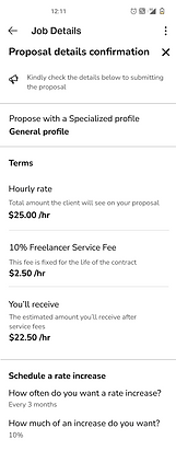
Error Prevention
Good error messages are important, but the best designs carefully prevent problems from occurring in the first place. Either eliminate error-prone conditions, or check for them and present users with a confirmation option before they commit to the action.
Issues
It’s easy to apply to jobs without reading all the details
Users aren’t alerted if proposals are too short, off-topic, or missing client-requested inputs.
Recommendations
Introduce a brief pre-submission checklist or visual cue to ensure the user has acknowledged all key job details.
Use lightweight AI or rule-based checks to flag issues like very short proposals, missing attachments, or generic responses, and offer a gentle warning

Redesign


06
Recognition Rather than Recall
Minimize the user's memory load by making elements, actions, and options visible. The user should not have to remember information from one part of the interface to another.

Issues
Filter option is available after the user has initiated a search
Recommendations
Filter button can be placed at the landing screen
07
Flexibility and Efficiency of Use
Shortcuts — hidden from novice users — may speed up the interaction for the expert user so that the design can cater to both inexperienced and experienced users. Allow users to tailor frequent actions.
Issues
No multi-select to batch-save or apply to jobs
Power users can’t bulk edit profile sections or edit few changes in the profile
Recommendations
An easy-apply form/ profile section can be added with pre-saved and editable content so that users may apply to jobs easily and quickly.

08
Aesthetic and Minimalist Design
Interfaces should not contain information that is irrelevant or rarely needed. Every extra unit of information in an interface competes with the relevant units of information and diminishes their relative visibility.
Issues
Job descriptions are often long and visually overwhelming.
Client info (location, spend, rating) competes with job summary for attention.
Doesn't use visual hierarchy well on dashboards and profile pages.
Inconsistency in alignment, buttons, and icons.
Icons do not follow the same visual language.
Too much visual information on actions in the profile page.
Doesn't use consistent font weights and heights
Recommendations
Create clean and minimal aesthetics with varied font weights and iconography to create visual hierarchy.
Keep in mind, the alignment and sizing of all the element.
09
Help Users Recognize, Diagnose, and Recover from Errors
Error messages should be expressed in plain language (no error codes), precisely indicate the problem, and constructively suggest a solution.
Observations
Error messages are give as inline text in clear and preceise language.
Additional information can be viewed directly after clicking tooltip.


10
Help and Documentation
It’s best if the system doesn’t need any additional explanation. However, it may be necessary to provide documentation to help users understand how to complete their tasks.

Issues
Help isn’t contextual—users are redirected out of flow. Users have to navigate to the help and support page to know more.
No FAQs are provided, instead a link to articles is given for each context.
Recommendations
Inline support text and help tooltips should be given wherever needed.
FAQ section should be added for general and frequent queries in brief words.


bottom of page